1.17.2013

Woo-Hoo... SuperPOX debuts on AHAlife.com!

I'm so happy to announce that one of my products "SuperPOX wall hook set," is being featured on AHAlife.com in collaboration with BOFFO NY. Let me know what you think of the item by liking the product page. 

Thank you again for your continual support.  

Now, go and check them out and don't forget to tell your friends about them!


9.16.2011

LMNOQ at SCOPE Miami... only if you vote for me.

  Hi Everyone.  I recently entered my studio's portfolio into a juried international contest called Art Takes Miami.  The winning portfolio will be given... (drum roll)  a show booth at the prestigious SCOPE Miami held during Art/Basel 2011, to display their art/designs to the world.  So, if you're looking for something to do and you have a burning desire deep down to help a somewhat young designer out, then please take a moment to cast a vote for my portfolio of work. 


http://lmnoq.see.me/atm2011/grid


Thank you so much and as always, I appreciate your support!


6.12.2011

No rest for the weary...

Hi Everyone, 
It's been a crazy few months of developing and finalizing projects, new commissions and whenever possible, experimenting with my own personal design collection.  In the last months, LMNOQ also participated in INVENTORYa major design exhibition showcasing the fresh new work of local South Florida designers and architects.  I'm also proud to say that the studio and I were featured in The Miami Herald and in the New York Times.  So, please take a few minutes to look over what's been happening behind the scenes at studio LMNOQ...


First up a room divider made from reclaimed vintage beer cans.  This was developed for Jorge Garcia the owner of Zona Verde a local restaurant / art gallery space.  The piece consists of just over 500 vintage beer cans of different brands and varieties.  Sometimes drinking on the job has it's advantages.


Next, one of my most favorite commissions this year, a new work desk for my friend Yovani Bauta.  He needed something deeper then average yet compact enough to be able to work around it in his studio space.  This piece has now become a cornerstone design piece for my studio and it's been customized in several different sizes depending on the clients needs.


I also developed some wonderfully simple wooden light boxes for my friend Russ Ronat's exhibition at the Bakehouse Art Complex.


Now, the most challenging build this year was designing and constructing the exhibition piece for my new friend Alba Fernanda Triana.  She's an amazing experimental composer from Columbia and what she required was a new housing for her existing interactive computer piece. 


I'm also proud to say that her work received an Honorable Mention from the Fifth annual All-media Juried Biennial.  

So let me know what you think.  I will be posting more of the work that my studio LMNOQ produced in the last few months as well as the current developments in my own design collection.  Thank you, and stay tuned for more.


2.06.2011

LMNOQ.com is ALIVE!!!!

I would like to give a big THANK YOU, to everyone that has purposely or accidently, visited my studio blog and checked out the stories and background tomfoolery that defines my studio projects.  And a special thank you goes out to those of you who took the time to post a comment or sent an email of encouragement or support.  It means a lot to me to know that I'm not alone in my design endeavors.  


So, I would like to announce that this studio blog now has a companion website designed by my good friend Babette Herschberger, where you can finally see the finished projects that my studio has been producing for the last year.  So, please take a moment and check it out. And as always, I would love to hear your comments. 


Thank you again.  Laz

LMNOQ.com

12.24.2010

Lets play house, MR.O


   I know... I know it's been a long while since I last posted about the going's on at my studio LMNOQ.  All I can say is that it has been an extremely busy and productive few months.  Each day has been a never ending rollercoaster of creative energy, from creating one of a kind furniture, to building adult sized playhouses, to developing my own products for a upcoming design show in the new year.  So, I finally found a moment to sit down and share with you some of the past work thats kept me up cutting and cursing to the wee hours of the night .  Thank you for your patience... and a wayyyy we go!


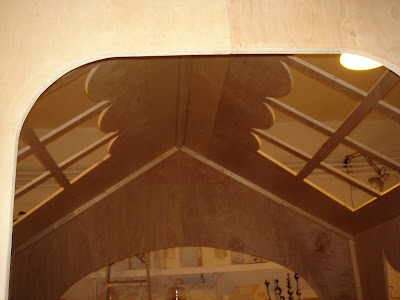
  Let me introduce you to my very super cool, A#1 friend Rita Motta.  She's one half of the creative duel that makes up studio MR.O.  Well, she asked me to help her recreate one of her famous "Casita" miniature models into a true to scale environmental structure to showcase and house her new line of cabinetry for an Art Basel exhibition MR.O was hosting. 


Rita taking care of a small detail in her "Casita" design.

Original paper model of her "Casita" with finished half panels in the background.


Panels after being cut, sanded and attached to their other half.  Next step assembling. 


   At this point, we are five days into the build with very little sleep and with three more days ahead of us assembling and painting.  So what do we do to help keep the sleep monkeys from stealing our energy? We dance...


   Well, she did most of the dancing, I just kicked back and laughed my head off. Slowly the "Casita" starts to take form and we both are loving what we are seeing.


All four walls are up and awaiting roof panels.
  
Roof panels are in place and its really starting to feel special. 

And after two coats of low VOC white paint... It's move in ready.


As you can see by the clock on the wall it was 4:00 in the morning when we finished  applying the last coat of paint. 

The finished "Casita" revealed at the MR.O Art Basel exhibition. 


    And, thats all folks... Art Basel was a success, MR. O's exhibition was well received and attended and I finally allowed the sleep monkeys to drag me into bed to catch up on some well deserved sleep; 17 hours straight of it.  And the "Casita" now awaits dismantling to be exhibited in an up and coming design show called "INVENTORY" to be held in Miami.  My studio LMNOQ will be participating in the show as well.  What fun we had.

9.28.2010

Look into my eyes... my EYES


Close up cuts of "The Face of Time" by Aurora Molina 


   One of the many reasons I started studio LMNOQ was not only to realize my own ideas by experimenting and making prototypes but to open a place where I can help local artists and designers achieve their own concepts. Well it's been a fun week of collaboration and exploration with some very talented friends. And the first one I would love to tell you about is the super talented Aurora Molina and her cool project.


Finishing the clock on the scroll saw


   I've been working with Aurora Molina on producing her soon to open exhibition in Miami when she mentioned that she's been looking for a new time piece for the wall of her studio.  I asked, why not design your own clock. Design it in your own style; an interpretation based upon your current new work.  She loved the idea.  So, I pulled out some 1/4" maple ply and she pulled out a pencil and we went at it.  And after some hours of her sketching and me cutting... "he" was born, "The Face of Time".  I think our result is amazing, fun and totally Aurora. 


Finished piece awaiting paint and a better wall to hang on 


   Notice some of the details.  Each eye is a separate measurement of time; hour and minutes.  Also, every line on his face and hands is cut out so when the piece is painted, the surface lines will still stand out, adding depth and a little texture.  Aurora was totally exited about the piece and so was I.  So, what do you think? 

9.12.2010

"BLOK" a 50 pound riddle...

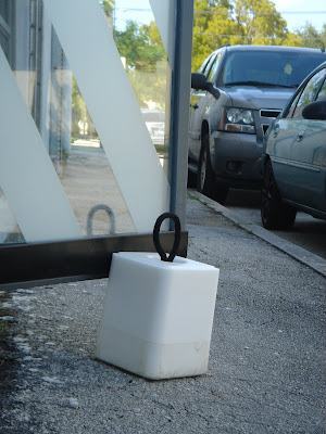
"BLOK" Doorstop manning the door @ studio LMNOQ

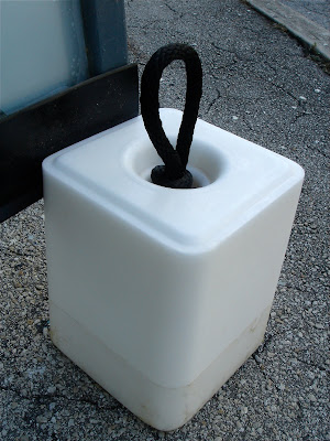
  What's black and white and weighs 50 pounds?  "BLOK", thats what.  One of the problems I've had from the first day I moved studio LMNOQ into it's new space was that the large glass entry doors that came with the space would slam shut at the mere hint of a breeze.  So, "BLOK" was born.  A twelfth century concept meets twenty first century design made from a pre-historic material.  Has anyone guessed from the above pic what the material might be?  If you guessed cement... you would be wrong my friend.  I'll share the answer to this riddle later.  What I will tell you is that I have a huge respect for this newly rediscovered material and I'm trying to incorporate it in some form or another into my product line.  In it's current design state it's a bit raw and limiting as a potential seller.  How many people really need a 50 pound doorstop?  But, keep an eye out for further developments on this concept.


Clue: It's lickable... 

Clue:  **** N Pepa...

I know you figured it out... It's SALT!  In northern United States, people know it as a salt lick for animals.  While in the south we use it to soften our hard water and help regulate the salt level in saltwater pools and now it's a doorstop. And yes, it does weigh 50 pounds. Cool right!? 


9.02.2010

Making "NO Time" for clients...

"NO Time" wall clock @ studio LMNOQ 

  Last month I was commissioned to design a wall clock for a local South Florida graphic design office.  The only criteria was that the design had to be simple so it would work well with their white minimalist interior and still function as a clock with a numerical time face.  Well, what do you think?  After several dozen pencil sketches, (call me old school, but I still love sketching with a good pencil), I worked out a solution to represent the telling of time in a graphically simple yet slightly abstracted manner.  I kept as much of the numerals off the face of the clock, isolating them around the edge to emphasis the center area and graphically build tension along the outer edge.  This gives the clock a greater sense of scale.  The clock visually feels larger then its 18"x 18" dimensions.  Well the client loved the piece and it's currently hanging telling time, in the main space of their offices.  I'm currently working on a version of the design where the numerals continue to wrap around to the sides of the clock. I'll update you with pics when its completed and available to purchase.


"NO Time" wall clock hanging with the POX coat rack and wall hooks 


8.28.2010

"POX" you...


POX suspended coat rack on display @ LMNOQ


   My new studio is located next to Coverings, an internationally recognized materials showroom.  And just recently they received the famous Red Dot award for an amazing new eco-friendly material they developed from recycled glass, "bioGlass".  So, to commemorate the occasion I created POX, a suspended coat rack based upon my initial wall hook design that I developed earlier in the year.  I decided to convert the front entrance of my studio into a large picture window display and suspended the POX coat rack from a 2"x 4" held up by some makeshift walls of 4'x 8' panels.  I also incorporated 4 suspended strands of lights to help illuminate the design and help it shine into the night.  Well, the design was such a hugh success with passersby that I took several orders for it that night. Needless to say, it's now part of my growing product line.


Each POX suspended coat rack comes with enough coated steel cabling to hang from any standard 8' ceiling and will be available in limited editions of 5 different colors. Price: $495.
I would love to know what you think.


Night time drops fast on the Red Dot, POX window display 


POX now hangs in the studio next to a few of my other new designs

8.26.2010

Concrete Dreams...


  One of the things I try to do at lest once a week is get out of the studio and drive around the city and look for inspiration for new designs from wherever I can find it.  Well, just the other day I came across an amazing collection of vintage patterned cement blocks at an old cement manufacturer.  Here in South Florida, its very common to find these decorative blocks installed in all kinds of architecture from residential homes to commercial warehouses.  And It has always been a dream of mine to produce a small book of all of the designs I come across that I love.  So, what a surprise to come across all these amazing shapes and forms in one spot and still available for purchase. Wow!


Just look at some of those forms


I'm loving the one on the left... alot